A book cover needs to stand out from the crowd.
“A picture is worth a thousand words.” – Fred R. Barnard
“Never judge a book by its cover,” we’re told. This may be sound advice, but it totally misjudges the jacket’s importance. Truth is, readers do it all the time, and a writer ignores this at their peril.
A book’s cover consists of three related parts: front cover, back cover, and spine. Each of these components plays a specific role. Together, they express a book’s identity and personality.
The Goal of a Front cover
Books with a striking image on the front jacket will stand out from the crowd and are more likely to be picked off the shelf or clicked online. They announce a novel to the world.
I briefed a graphic designer to help create covers for my novels Graëlfire and Graëlstorm—James at GoOnWrite. He emphasized that a front cover is a piece of art with a specific purpose: to grab the reader’s attention. In the same way a movie poster isn’t a scene from a film, the image shouldn’t try to recreate a passage from a book. There’s often a short story blurb on the book’s back cover, and so front covers need only convey the essence of a story—something a potential reader can absorb at a glance. Maybe this is what the veteran American book cover designer Chip Kidd meant when he said, “A book cover is a distillation. It is a haiku of the story.”
When readers scan the image, it should fire their imagination and pique their curiosity. As well as showcasing the book’s title and author’s name (more about this later), the front cover should express the book’s genre, its age category, and capture its mood and tone.
Creating Great Front-Cover Art
James stressed that the front cover must jump out and catch the reader’s eye. The image should be strong, engaging, and memorable. That means picking only two or three colours appropriate to the mood the writer is trying to express, using contrast to grab attention. It should also have a clear focus on a single feature, otherwise the cover risks looking cluttered.
Choice of colours should not be surrendered to personal preference. Colour has a direct impact on our brain, and while bright hues may work best for children’s novels, a darker aesthetic may have more impact for horror and fantasy stories. Shadow and darkness put our minds on alert. They evoke mystery and engage our curiosity. They stimulate our imagination.
Here is how we put these principles into practice with the front cover of my latest novel, Graëlstorm:
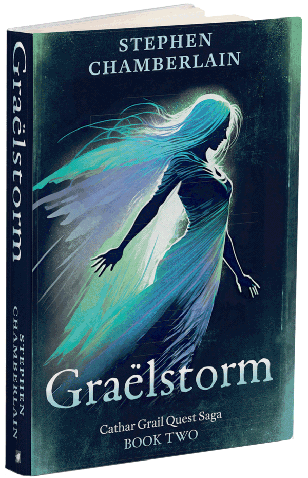
As you can see, I opted for a black background to provide a strong contrast with the backlit figure evoking a tone that is solemn but majestic, irresistible, yet unnerving. To make the dark areas more interesting, James, suggested adding dark green texturing, especially at the edges and corners. This not only gradients the background, but also contributes to the mood of mystery. I chose a single image to epitomize the strong female principals in the story—something dynamic and bristling with energy—a figure with a sense of forward propulsion. I think a sense movement is important. Our eyes are designed to notice things that move; they engage our interest and hold our attention. The streams of Graëlfire radiating off the figure’s back and shoulders are meant to invoke the presence of a being with supernatural powers. I want to convey an impression of transcendence that arouses fear and respect…awe at the mystical and fascination with the otherworldly. That’s plenty of goals to pack in one image. I hope you find Graëlstorm’s front cover as emotive and arresting as I do.
The American writer, Larry Correia sums up cover art well: it “serves one purpose, and one purpose only, to get potential customers interested long enough to pick up the book to read the back cover blurb. In the internet age, that means the thumb nail image needs to be interesting enough to click on. That’s what covers are for.”
The Back-Cover Blurb
The front cover may be a novel’s opening pitch, but an image alone won’t sell a book. As Chip Kidd writes, “it’s about whether the book itself really connects with the public, and the cover is only a small part of that.”
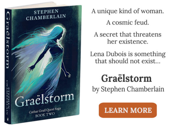
This is where the “blurb” takes over. If the front cover catches the reader’s eye, then they might flip the book over and read the appetizer on the back. Where the front cover is bait, a pithy blurb is the hook. Often between one hundred and two hundred words, the blurb isn’t a synopsis that tells the story; it’s a teaser that should arouse readers’ concern for the main character by focusing on the conflict and identifying themes. Here is the blurb I wrote for the back cover of Graëlstorm:
A unique kind of woman
A cosmic feud
A secret that threatens her existence
Lena Dubois is something that should not exist…
Lena’s Graël quest is over, and her nemesis defeated. But that was only the beginning. Now renegade Graëlheem abduct her to a realm beyond Earth, where she discovers her true identity. Plunged into a clash between immortals, she must defeat cosmic forces to survive and fulfil her destiny.
Welcome to a fantasy adventure full of intrigue, tyranny, and the lust for power, shot through with the angst of star-crossed attraction.
An exciting new twist on Grail myth, Graëlstorm is the sequel to Graëlfire.
Showing Some Spine
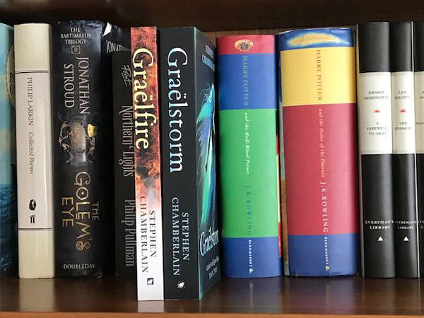
The third component of a book’s cover is the spine, that narrow band bridging its front and back covers. Its primary purpose is to bind a book’s pages together, but there is more to it than that. It is the first feature a potential reader browsing shelves will see, and so it is key to a book’s discoverability. This may be irrelevant to a world of e-books, but when it comes to the printed version, a book’s spine must make a striking impression. The essential elements are the book’s title and author’s name. Simplicity is the key to avoid distraction.
Having the right title is one of the most important decisions a writer will make, one that deserves a dedicated post. Suffice to say, the title must stand out from the spine’s background, which is often a continuation of the book’s front and back covers. A contrasting colour for the text and a large font size should be enough to draw the reader’s attention, while font type can hint at the book’s genre. Within speculative fiction, serif fonts (with their little hooks on the end of letters) seem a common choice for fantasy and horror titles, while sans serif fonts are a go-to for science fiction. And within each type, there are thousands of font styles to choose from. The world is your oyster. You can also combine different fonts.
Means to an End
It’s hard to attract readers in a saturated market, and nailing a great book cover and blurb are essential. They should be attractive and exciting, because they’re the lure that gets a potential reader to bite. Getting it right takes considerable planning involving imagery, colour palette, fonts, and some creative skill as a wordsmith. But all that is just the beginning. Once a reader has swallowed the hook and opened the jacket, it’s down to a strong opening chapter to reel them in.